
“Music, once it escapes these instruments or those loudspeakers, no longer belongs to those musicians […] but is owned by the listeners as they interpret it for their own personal purpose.“
— Malcolm Garrett
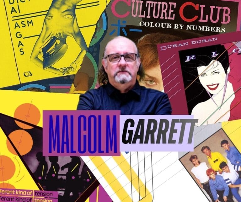
Malcolm Garrett, the designer who redefined the record sleeve as a visual system. From Buzzcocks to Duran Duran, his work changed the way we see and understand music. He is recognised for turning sonic identity into graphic narrative, for geometric precision and for seeding traces of 20th-century art into every detail. He kindly granted us this interview at MgzMag to share, among other things; how one designs what is heard, his origins as a record sleeve designer and the future of image and design in an era of social media and online music platforms.
Born in Manchester and later forged in London, Garrett was a pivotal figure in a pre-social-media era, when album covers were a band’s main window to the world. He shaped the visual language of punk, modern pop, and post-punk through his extensive work defining the visual identity of the scene; including everything from the first poster and cardboard record sleeves for Buzzcocks, to iconic album covers like Rio, Seven and the Ragged Tiger, and Duran Duran for Duran Duran, plus defining work for Simple Minds, Peter Gabriel, and Boy George.
Garrett elevated detail into story: a real model; symbolism as a map; typography that teases perception and a back cover cut from a full band photograph. Later came formal recognitions: Member of the Order of the British Empire (MBE)and Royal Designer for Industry (RDI).
Geometries that Think in Music
MgzMag: The use of geometry, colour, composition and symbolism in your sleeves is truly distinctive. What would you say were your main influences and did you share these with the bands themselves or were they more of a personal visual language?
Malcolm: In my mid-teens I began to be consciously inspired by movements in 20th century art, most especially by Pop Art (Warhol and Lichtenstein of course, but Peter Phillips was a particular favourite). But also, the crossover of design, architecture and art that was seen earlier in the century with Dada, Futurism, Constructivism, Bauhaus, Art Deco -all of which as is self-evident displayed bold geometric structural forms and patterns which I absorbed into my printed graphic work. In parallel I couldn’t help but notice the modernist architecture of the 60s, and perhaps surprisingly the industrial and gothic revival architecture of the Victorian era which I grew up up with in the industrial towns of Manchester and Liverpool.
For Malcolm Garrett, Manchester wasn’t just an address; it was a tool. That eye, trained between industrial heritage and urban renaissance became grammar for music: solid forms, chromatic economy, precision as emotion.
From Drawing Board to Vector
MgzMag: In the days before design tools, the technical execution was far more manual and precise. How was your working process like and which tools were essential in achieving such exact compositions?
Malcolm: Tools have always, and will always, define the outcomes of visual creativity, whether that be in the arts or, as in my case again, is more design focused. Mastering the use of a variety of tools was one of my earliest challenges. I like mathematical geometry and its drawn theorems, and began to utilise the precision of, firstly, fine line pens (such as Rötring) with rulers and compasses, and then when I acquired a professional drawing board, parallel motion rulers and adjustable set squares expanded the scope of my abilities, and permitted the development of a more accurate rendering of geometric shapes in my work.
This of course was later enhanced, and refined with the use of computer software such as Adobe Illustrator, when desktop computers became available in the mid-80s. The appeal of digital drawing tools was immediate, as they enabled me to transfer what I used to do manually on drawing boards, onto the screen, and do it more accurately, more quickly and ultimately ‘better’.
MgzMag: Which sleeve proved to be the most challenging to produce and was there ever one you thought the band wouldn’t like … only for them to absolutely love it? Do you have any hidden detail embedded in a record sleeve that you’ve never revealed before like on Rio by Duran Duran. Where the back cover shows only a cluster of buildings that are, in fact, part of a full band photograph?
Malcolm: I don’t recall any one sleeve being disliked by the band at first until loved later, but it is true to say that Buzzcocks «A Different Kind of Tension» which I chose to take down a very personal graphic route, was loved by Pete Shelley and hated by Steve Diggle. He refers to it in particularly disparaging terms in his book ‘Autonomy’. Their appreciation or otherwise never wavered.
I was talking about the design of Buzzcocks record sleeves only yesterday with am member of staff at Middlesex University, and revealed that every single sleeve for Buzzcocks has some reference to the work of a 20th Century artist, some much more obvious than others, but nevertheless they are there to be found. I worked closely with their manager Richard Boon, who himself had studied Fine Art at Reading University and we loved to embed subtle reference in the work, whether it be Malevich, Reinhardt, Duchamp or The Beatles.
Between Buzzcocks and Duran Duran, Garrett’s detail isn’t decoration, it’s a system. Seven and the Ragged Tiger scattered symbols like a treasure map and runes; Rio‘s iconic face was a real model and that back-cover parallelogram was cut from a fuller band image.
Orgasm Addict built from photocopied cut-and-paste elements assembled by hand. It was conceived to work from any orientation, whichever way you turn the sleeve, it still reads, reveals and makes sense. (Malcolm even directed a bus-stop photo session with each member, extending that raw, systematic approach beyond the cover itself)


The Album cover as Cultural Trigger
MgzMag: One of the most controversial covers of all time is Buzzcocks’ Orgasm Addict. Do you remember the impact it had at the time and how the band reacted when you first presented it to them, given the controversy punk was generating in society? Why do you think this cover has been studied in art schools?
Malcolm: I can’t fully answer the second part of this question, but there are many components which may make up a reply. The imagery created by Linder is consciously ‘feminist’ but challenging to all genders. The Bauhaus inspired typography and colour scheme was challenging in a punk rock environment that was only just coming to terms with, and enjoying, Jamie Reid’s brutal ransom note graphic style for the Sex Pistols. There was a sophistication that was not really seen in the graphic work in the music industry of the day. The clarity of ‘brand Buzzcocks’ extended not just across the front and back of the sleeve but to the label on the record, and led from there into the marketing materials including posters and button badges. That level of consistency across all aspects was simply not seen in that way, in such an arresting format, elsewhere. The strict adherence to a non-punk, simple palette of blue graphic elements on flat yellow background certainly helped make it stand out from the b/w DIY photocopied contemporaries, and presented Linder’s imagery to best advantage.
The band had been using Linder’s montages on handbills etc until that points d=so it was a group decision to select that auricular image for the sleep. And then the first they really saw of the the way it would b presented was when the sleeve was actually printed. Only Richard Boon saw the artwork during production.
It was a before and after moment: multi-orientation reading, collage and photocopy at a time when even a copier was a luxury and a level of visual consistency that’s still studied.
From Cardboard Record Sleeves to Mobile Feeds
MgzMag: Today, music is consumed primarily on digital platforms, where the cover is often reduced to a tiny icon. If you were designing for an artist now, how would you reinterpret your style for this format without losing its impact?
Malcolm: I argue that there has for quite some time been a visual component to the presentation and promotion of all contemporary music, which let’s remind ourselves has no actual physical form. It exists literally in the air. That said, humans are visually-led creatures so all music has the ability to conjure up visual images in the mind, and vice versa. It’s the designers job to shape what those visual components might be.
MgzMag: Do you believe the resurgence of vinyl is partly because younger generations crave that extra element (the cover art, the inner sleeve, posters and the printed lyrics) that used to come with the record?
Cardboard record sleeves were important in that regard for the last several decades but it’s no surprise that as they cease to be central to transporting, promoting and direct marketing music then they increasingly become irrelevant in any true sense, despite the best efforts of nostalgists and those, again like me, who grew up with them. It is a complex relationship we have with music presented i this way, and I’m not suggesting it will go away any time soon. But, the current importance and spectacle of the live environment, and the proliferation of ‘merch’ which now conveys the same graphic messages formerly constrained to LP sleeves clearly demonstrates that the platform has shifted, but the visual complete to music is no less important. than ever before.
Garrett worked when sleeves were the primary visual gateway to an artist’s world, the place you first “saw” the music and its marketing. Today that gateway is split across the live stage, screens (streaming/social) and merch but the need for a coherent visual system hasn’t gone anywhere.
Design as the stage and the artist as the real focus
MgzMag: Many of these sleeves avoid showing the artist in a literal way, instead constructing an entire graphic world around the music. How deliberate was that decision to move away from the traditional portrait and put the design itself centre stage?
Malcolm: It was a very deliberate decision to move away from using the LP sleeve as simply a vehicle for a gallery-like image of just photo of the band (as demanded by record company), sophisticated and stylised illustration (as aexemplified by Roger Dean) or clever, standalone photographic idea, often with no ultimate relevance to the band or their music (the masters of which were Hipgnosis). The true pioneer for the representation of an entire graphic world within which the band existed, was Barney Bubbles with his work for the counter-cultural collective Hawkwind in the very early 1970s. His work was unarguably of immense importance in shaping my thinking both consciously and subliminally.
It was a natural decision for me to not so much put the design centre stage as you suggest, but to use the design as a stage which presented the music, and the musicians creating it, as the actual focus. The design only exists to enhance the qualities of what is invisible yet solidifying in our minds.
That’s why Duran Duran’s image became an ecosystem, not an isolated group of album covers; and why Buzzcocks’ typographic and chromatic coherence stretched across sleeves, labels and posters.
Music belongs to the listeners
MgzMag: You worked at a time when music and design were constantly feeding off fashion, cinema and innovative graphic work. What was that intersection of disciplines like, and how vital was visual culture to the music scene back then? Which design principles from your era do you think remain timeless and just as effective now?
Malcolm: Yes, all of that is true, but I don’t think anything has changed. There is a constant cross-referencing of music, media and lifestyle. I’m sure this was as much the case in Shakespeare’s time, as it will become in the virtual worlds of AI.
I frequently argue that the music we absorb during our mid-teens, when we are learning how to become ourselves, will stay with us as ‘our’ music, as ’the’ music defingin our personae in fact, for the rest of our lives. Music helps us establish our own individual identities, and helps us express thoughts and emotions that we are not at that point in our emotional development yet able to properly express for ourselves. We identify with what is being said or portrayed by these other beings, which at extremes we idolise, as we feel they most closely express our own inexpressible thoughts.
Ironically then, whilst I stated earlier that as a designer I was always aiming to provide a graphic world for the musicians, the reality is that music, once it escapes this instruments or those loudspeakers no longer belongs to those musicians, and certainly not to the desires, but is owned by the the listeners as they interpret it for their own personal purpose. The designer is a conduit that helps that process.
An Irreplicable Legacy
The legacy of Malcolm Garrett is having turned the sleeve into a visual representation of the music itself. Geometric precision, signals from 20th-century art and a coherence that crosses formats without losing its pulse. For example: the Buzzcocks record sleeve was as daring as it was scandalous in its time and despite tributes is imposible to reproduce it. No one has matched its edge. His work is a case study in how influences well-orchestrated produce a unique style. He demonstrated how environment, Manchester and then London, shapes the eye and the outcome. Such is the measure of his influence.
MgzMag: Thank you, Malcolm, for your generosity and collaboration.
Mariana Gómez Torres for MGZMag
To Listen

This site is maintained thanks to donations from our visitors. If you like our work and want to reward it, remember you can buy us a coffee through our buymeacoffee account: mgzmag

You can scan the following QR code with your mobile phone, thank you very much.